Web Design
Website Design Update
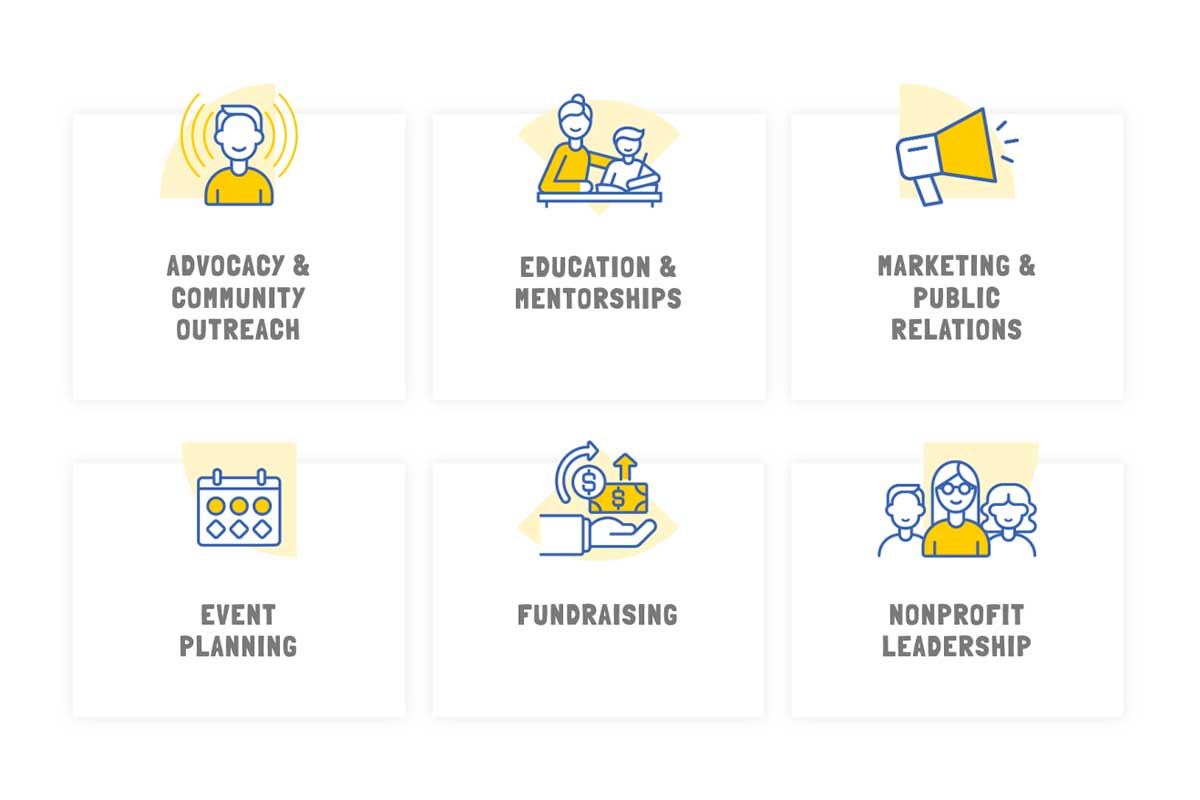
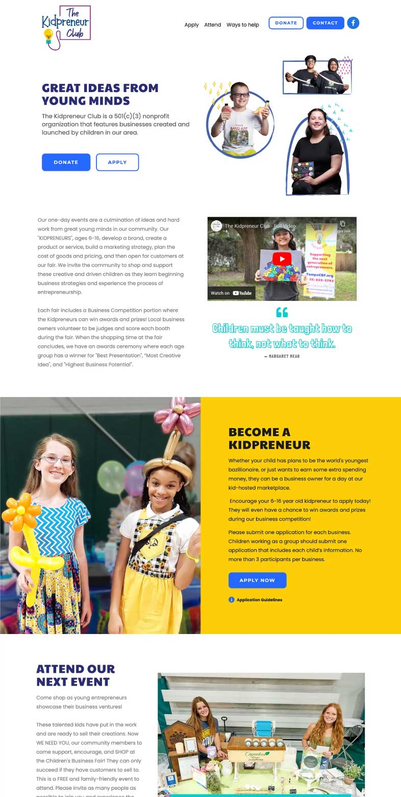
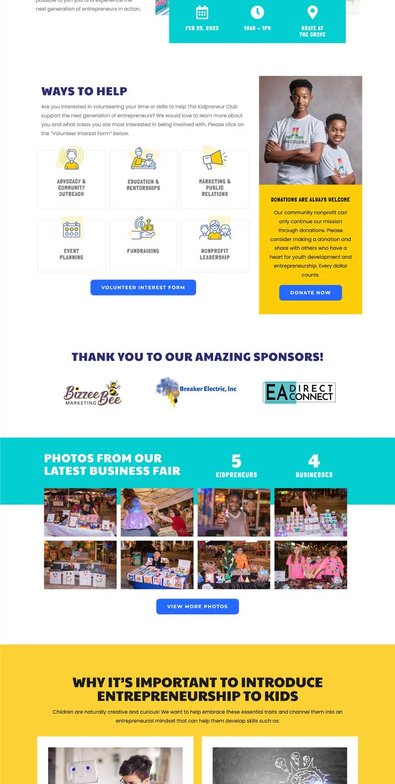
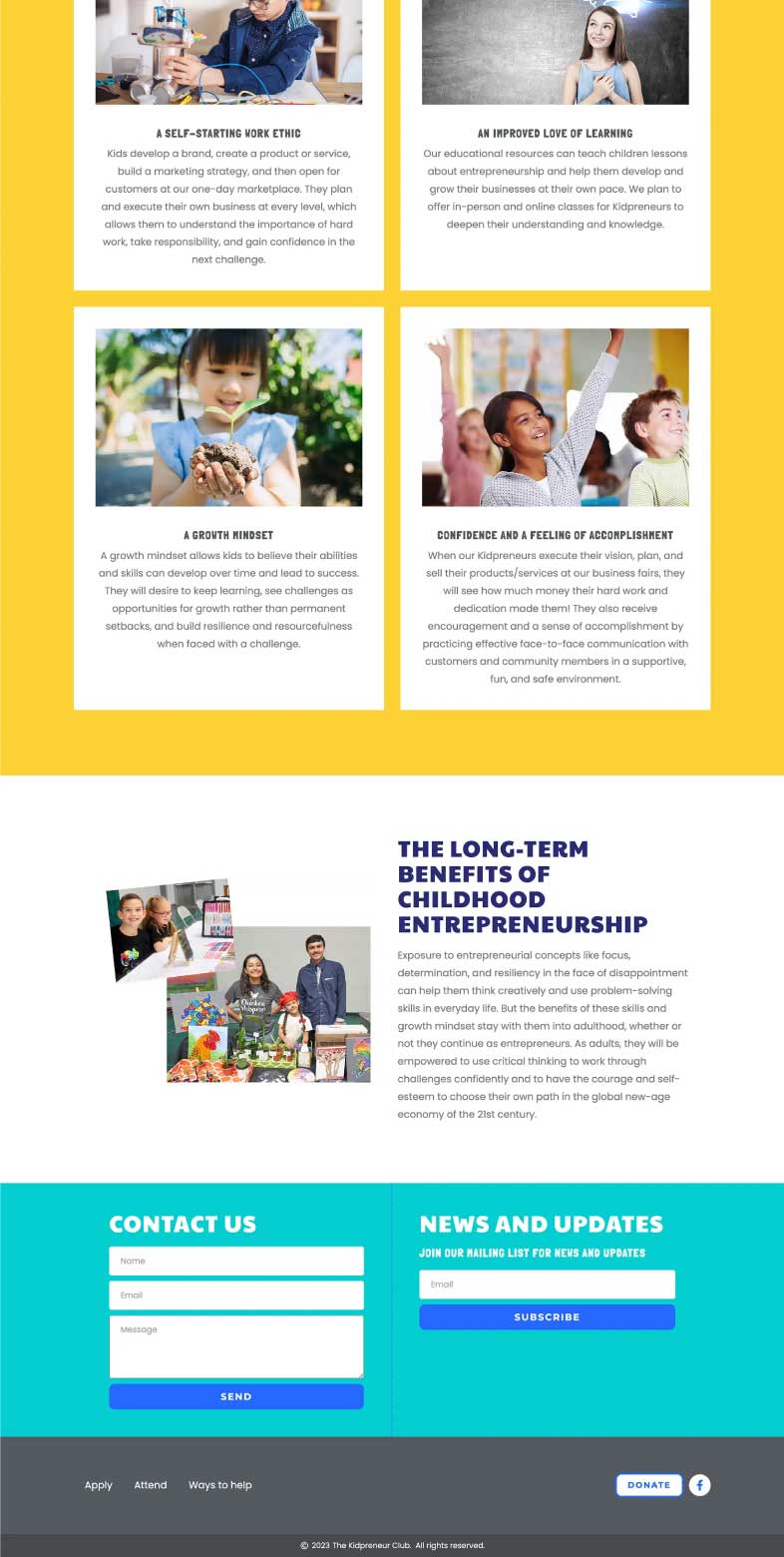
This client needed a refresh of their website as it had become disorganized and outdated. After a deep dive with the client, I reorganized the content into sections based on the their specific needs. I worked within the existing color palette and playful vibe; adding custom icons and graphics that tied in with the organization’s overall mission.
I had so much anxiety about making a website for my nonprofit organization, but Gayle made it much easier. She saw my vision and made sure to have the site look the way I wanted in order to represent our mission. I highly recommend her!
— Danielle Cannon
Founder & Executive Director, The Kidpreneur Club
Process
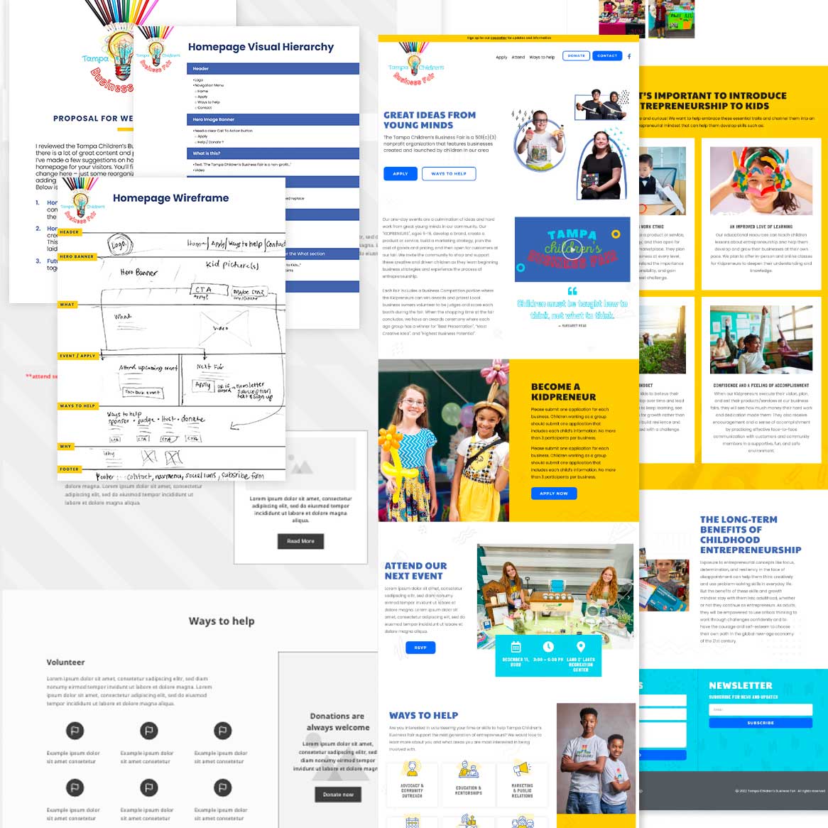
Created a page structure utilizing a visual hierarchy approach, placing essential information in a top-to-bottom order of importance.
I used Adobe XD to create wireframes, offering a variety of layout choices for organizing content according to the approved page structures.
I collaborated with the client, integrating their input into the wireframe in real-time. This resulted in a solution that perfectly aligned with their needs.
I crafted this single-page website in Figma, staying true to the brand’s color palette and utilizing web fonts that complemented the design. I curated images sourced from the business fair to create engaging visuals. Additionally, I enhanced user navigation by incorporating call-to-action buttons. The aesthetic was further enhanced with meticulously curated icons. To facilitate interaction, I integrated two forms – one for contact purposes and another for newsletter subscriptions.
Transitioned seamlessly from design to development, using Elementor on WordPress to create a responsive and functional website. The end result is a dynamic site that effectively addresses the client’s needs, leaving them delighted with the beautiful design and impressive functionality it offers.
Highlights
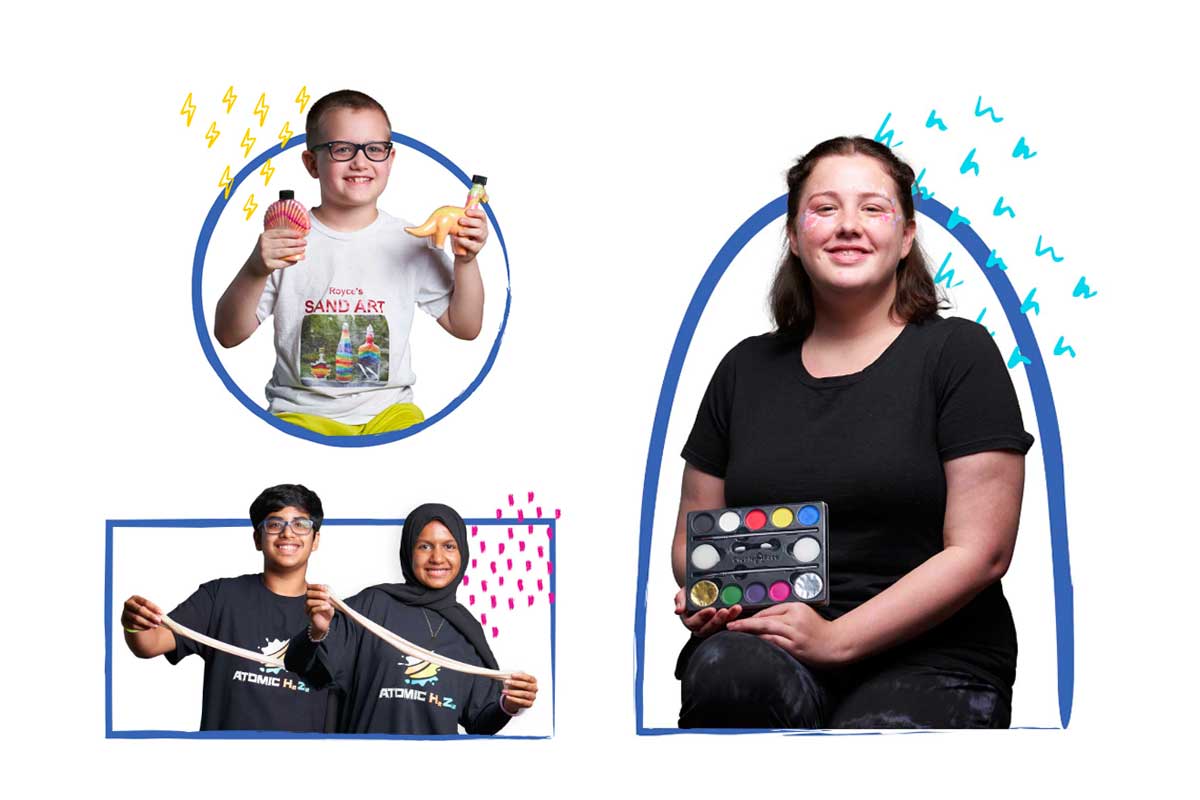
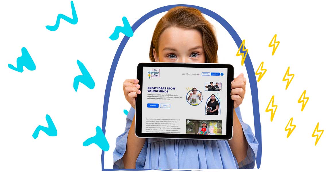
To illustrate this organization's mission, I framed images of “kidpreneur’s” with their goods in brush strokes. I paired the images with brightly colored doodles to embody the vibrant and playful essence this brand.
