Web Design
Website and Branding Refresh
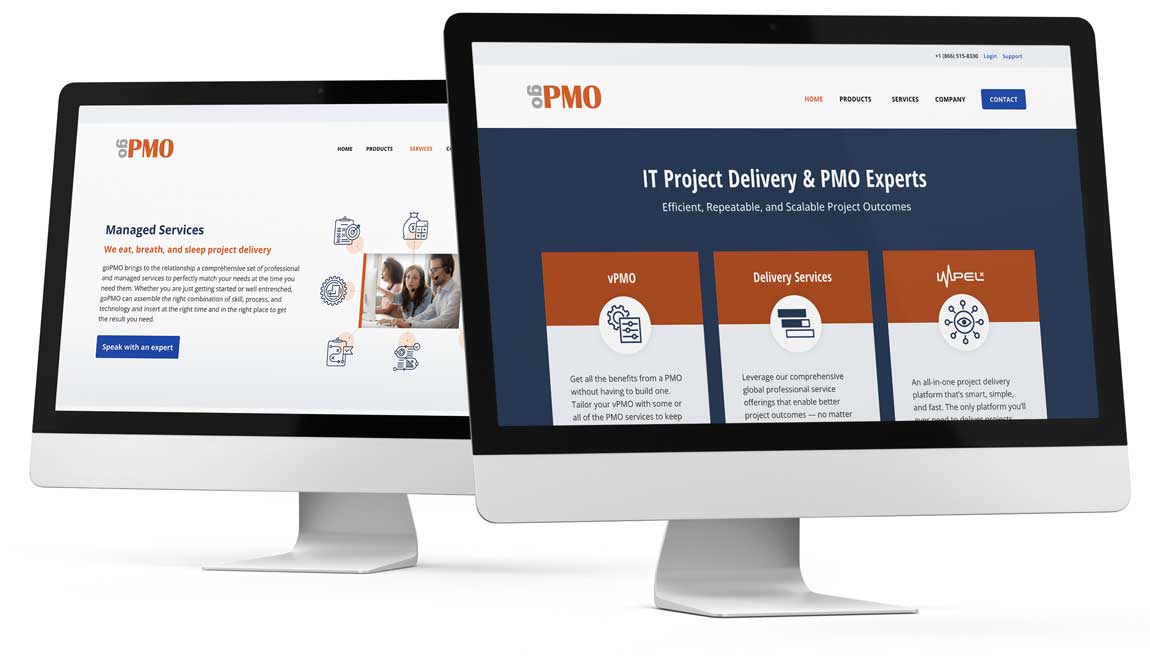
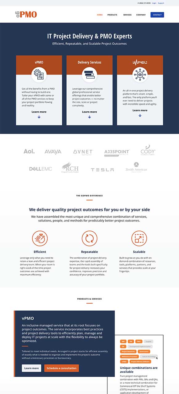
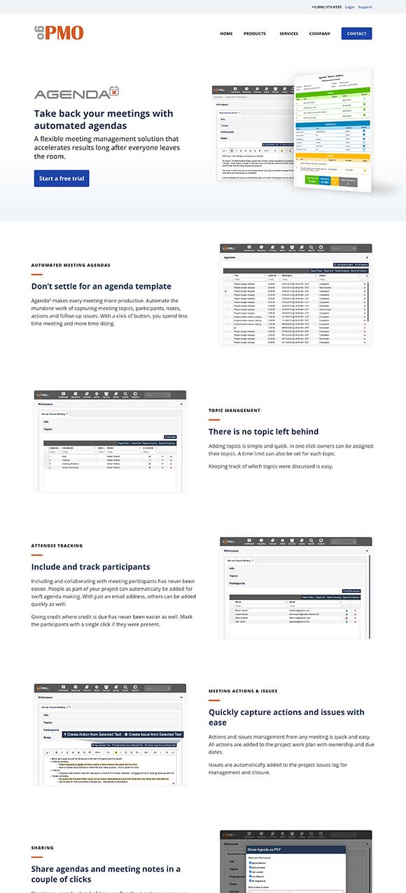
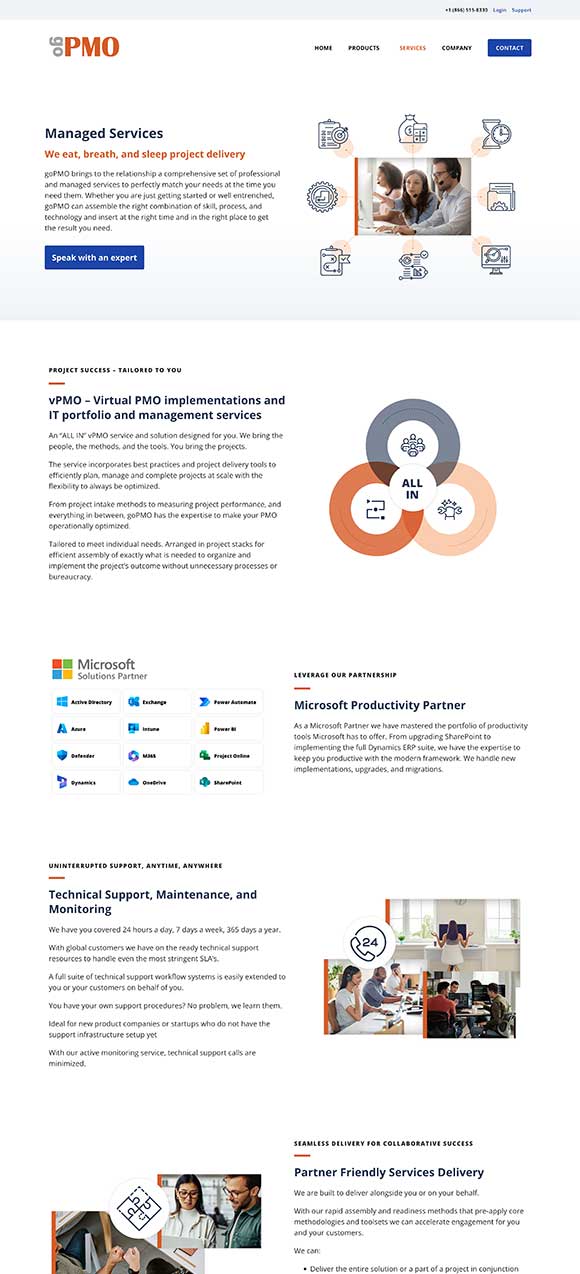
This client wanted to spruce up their cluttered website that was struggling to showcase its offerings with imagery that didn’t connect well with the company’s identity and services. I set out to address these issues by reorganizing pages, adding call-to-action buttons, and integrating carefully curated imagery and design elements. This comprehensive redesign not only enhances navigation and visual appeal but also ensures an engaging and enjoyable user journey.
Gayle was great to work with. She was responsive and creative.
— Robert Williams
President & CEO, goPMO, Inc.
Process
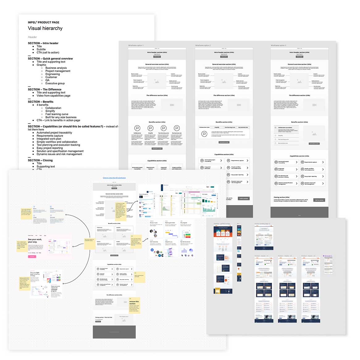
Developed a page-by-page outline employing a visual hierarchy system, prioritizing key information from top to bottom.
Utilized Adobe XD to draft wireframes, providing diverse layout options for arranging content based on the endorsed page outlines.
Conducted competitor research and crafted a whiteboard representation of their information layout. Collaborated closely with the client to identify preferred design elements and areas for improvement.
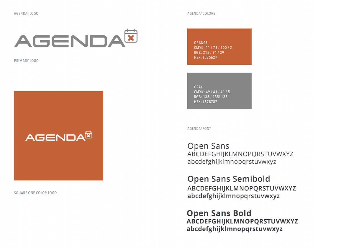
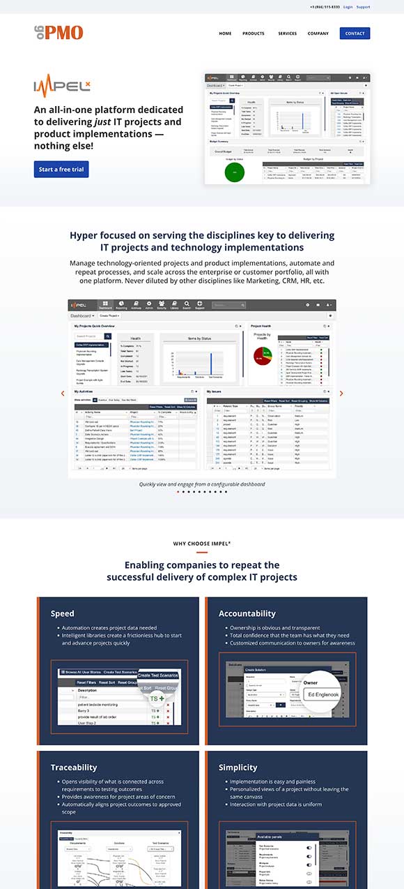
In Figma, I designed the pages based on approved wireframes, blending in new brand colors and imagery that perfectly matched the content. Additionally, I crafted new icons, spruced up the color palette, created product mock-ups, designed a new product logo, and added a dedicated landing page to showcase the product.
Smoothly moved from design to development, using Elementor on WordPress to build a responsive and functional website. The final result is a dynamic website that effectively addresses the client’s concerns—leaving them thoroughly delighted with the outstanding user experience it delivers.
Highlights
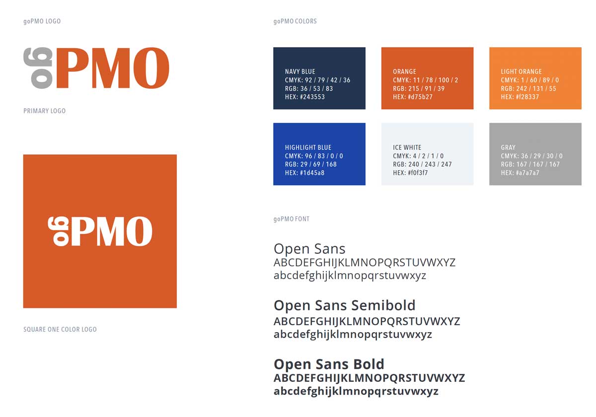
Revitalized and modernized the
brand color palette
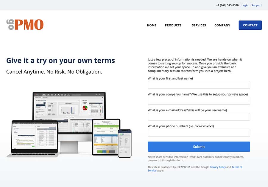
Improved free trial landing page
with product mockups on various devices
Developed a series of icons in
accordance with brand standards
